Monday, April 25, 2011

BLOG MOVE

Dear Friends:
In order to represent my eclectic obsessions better I have moved my blog to a new address. 

I would very delighted if you choose to join me, at my new address. 
http://mzjohansen.blogspot.com

My book blog blog has not changed

Saturday, January 22, 2011

Please Join Me On My New Blog

Dear Friends:
I have moved my blog to a new address. An explanation of why I decided to do this is on the first post of the new blog. I would be so happy if you will join me, bookmark, and follow me on the new address:


My book blog blog has not changed

Tuesday, January 18, 2011

New From Kandi Corp! DeColourant and DeColourant Plus : Color Remover and Color Replacer For Cloth and Paper

Those of you who have been reading my blog for some time know what an inveterate gadget girl I am - and you also know how much I love trying new products. I was very fortunate to have been given an opportunity to try two new products from KandiCorp called DeColourant and DeColourant Plus. These formulas are for use in both removing, and removing and replacing, colors on natural fabrics and papers - an alternative to using bleach.
DeColourant  is available in(from left to right:
  • Mist- great to use for creating cloud effects
  • Paste- I found this to be the best for use with  stencils and stamps
  • DeColourant Plus ( 2 bottles)- this product both removes and replaces color and it is available in a plethora of great colors. My packet contained lemon yellow and neon orange (the person who chose the colors must have bee psychic eh?!)
These are the product highlights from the promotional flyers:
  • Ready To Use- Non Messy Formula
  • More Color Removed From Natural Fabrics
  • Precision Fine Line Detail
  • Will Not Stiffen Fabric
  • Will Not Weaken Fabric
  • Pleasant Citrus Scent
  • Safe For Children

I decided that I would try the products on a Moda marble in black, a linen in green and a dark green paper. Next I chose a stencil (I ultimately used only the sunflower) and a few foam stamps.
The paste product is a very creamy texture and worked, IMHO, the best for both stencils and stamps. It did, indeed, provide good line detail. I tried the mist with the stencil and ended up with a blob - but it worked well as an overall spray to simulate clouds.The product  is applied and then allowed it to dry. thoroughly. Next step: you iron - and that's how you remove the color. The simple directions say that using steam removes even more color - and it did.

Below you can see the fabrics and paper right after I finished ironing the color out. Before washing the hand of the fabric is a bit stiff - rather t=like dried soda soaked fabric. Once washed, however, the hand is as soft as ever. That's a very good quality of this product. Additionally, this product also can be activated by the sun - so you can use it to sun print  paper, fabric, tee shirts and more.

Below: 
You can easily see that the best effect was achieved when I used the paste with a stencil (left). The paste used on a foam stamp was less precise, but wasn't bad either. On the bottom left was the mist with a stencil - it created a lovely blob. I suspect better results might be achieved if the fabric was dampened slightly to allow the stencil to 'grip' the cloth a bit better. The bottom right was a very light application of the mist on stamp - and you can see that not much happened....
 A close up of the sunflower stencil applied with paste using a stencil.
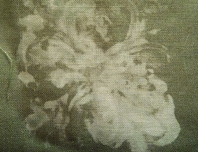
 Close up of the stencil on linen - not quite as crisp detail - let alone the singed fabric! 
I used an old iron on the linen setting but that I had forgotten 
that this particular iron had the nasty habit of getting very hot!
The foam stamp used with the paste on linen... still not as crisp as on cotton. It could well have been operator error though. I think there is a bit of a learning curve with this. As with any paint on a stamp one needs to learn the best combination of product, pressure and fabric.
To my nose this product smells rather ammonia-y with a hint of citrus. It is not as nasty as bleach but it IS something that I think you should use either outdoors or with very good ventilation. As you might expect when the dry cloth is ironed it creates a cloud - and that, most decidedly, needs a good breeze to blow the residue out of the air.  I have asthma and I didn't go into a paroxysm of coughing or need a rescue inhaler when I used this indoors - but I DID have a fan on high with a back door open to provide some ventilation when I ironed. I think it pays to be cautious. I do believe that this wouldn't be as harmful to fabrics as bleach - even with bleach neutralizer. I believe it has been proven that bleach discharged cloth will continue to degrade at a higher rate over time than untreated cloth will. In that respect alone I think this is an excellent alternative to bleach discharging.

Below: 
using the spray DeColourant on the black Moda Marble. The discharge is comparable to bleach I think...along with the interesting color changes that can occur. Yes, I think this is a great application for creating sky textures.
Below: 
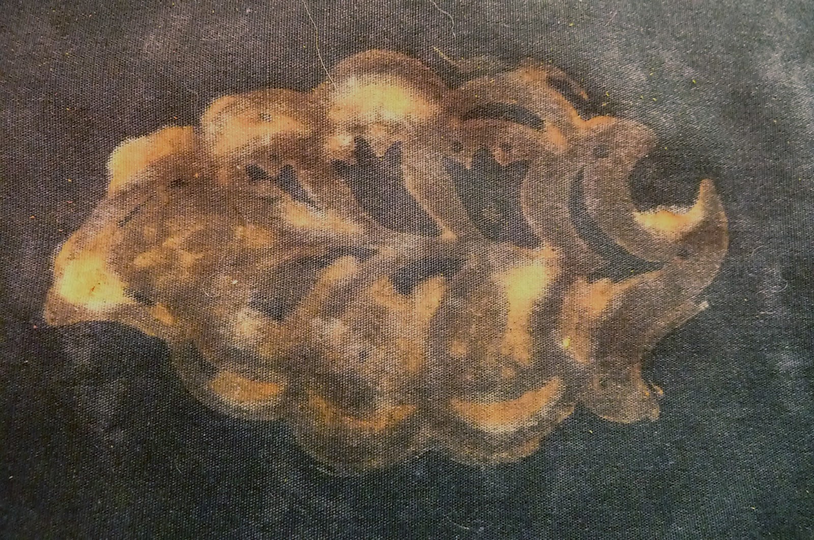
Now, this is the very cool DeColourant Plus in action. I used foam stamps. The top photo is Lemon Yellow on Moda and the bottom is the Neon Orange.I do enjoy the way the product both removes and adds color in one fell swoop. It works quite well - and is a very interesting concept.
Below:
This photo of the Neon Orange is a bit washed out. What can I say. It's POURING rain and really dark and dank out doors- but it worked okay with my happy light for lighting!
Below:
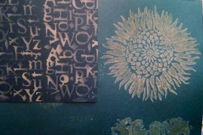
Ah! Here's the results on paper. The black bit of paper on the left was discharged with bleach. The dark green paper on the right was discharged with the paste DeColourant and the sunflower stencil. Excellent results!
I think this is a good product and an excellent alternative to discharging with bleach. I think that adequate ventilation is a necessity. I like using the paste very much - it does indeed allow for fine detail and is easy to apply with a brush. I love the concept of being able to both remove color - and replace it - in one application. What a cool idea. All in all I think this product provides a lot of very interesting possibilities and is well trying. It works like a charm on paper - and should have wide appeal not only to textile artist but also to mixed media artists and journal-ers. It is available in mist, paste, many colors, and very handy sets of colors that are available as pastes or mists!.Thanks Kandi Corp for developing this excellent new alternative to using caustic bleach!


note:
This product was provided to me by the manufacturer for the purpose of an honest review. No other remuneration was provided.

Monday, January 17, 2011

Mapping Happiness

Sometimes it pays to NOT rip up something that you aren't happy with. Such was the case with this journal page that I started some time ago. I didn't like it in it's original guise and had been tempted to tear it out of the book and toss it. I hadn't even opened this particular drawing pad in a long time but when I did I decided to rework the page. It looked like a map to me and I wondered what it was a map of....

About the same time I happened upon a copy of a poem by John Trudell that I particularly liked. It spoke of things that I have often thought but have not, perhaps, acted upon as much as I should.

 It reads like this:
we are part of the dreamtime
happiness is one of the colors
there are shadow casters who trick us about happiness
we are taught to wish for things to make us happy
we are not taught to wish for happiness itself.
we can't buy happiness
we can't sell it,
we can't steal it
we can't borrow it
and we can't capture it

but we can create it
love can't bring us happiness
but happiness can bring us love
power can't bring us happiness
but happiness can shoe us power
on the line of what is real and what really isn't
dream for happiness
somewhere between heart and mind
the spirit of life can be seen
happiness comes and awaits dream
Perhaps it is a map to happiness after all. I'm glad I saved the page and found the map. Now I just have to follow it.

Saturday, January 15, 2011

"Creative Combos" ATC Swap

The theme of this month's Arts In The Cards swap was "Creative Combos".

The task was to choose one material and one medium from the following lists:
Materials:
cotton, metal or vellum
Mediums:
metallic paints, markers, pencils, inks

To assuage my continuing fascination with metal I chose the material metal and the medium metallic paints.  To make these cards I first embossed copper foil, torch brazed the foil and then glued it onto a heavy paper backing that I had first painted black. Next I added metallic paints in sage, barn red and lamp black that rubbed into the embossed metal with a soft cloth.  I added some Oriental themed papers topped them with an embossed matte black metal square to which I added a hand stamped brass tag. I am happy with the results and I am becoming more engrossed with metal. I'm planning to use similar techniques for some "Valentine themed" Inchies and ATC's for another group.

Unfortunately the very rainy, very dark weather as well as my own laziness in bringing out my light box afforded these relatively poor photos. Hopefully, you'll get the idea!

Wednesday, January 5, 2011

Journal Page 1-1-11

This is a New Year's page that I made using a Slice machine. The Slice machine is made by Making Memories and it works like a dream for cutting fonts, words and a wide variety images. It will accept embossing cards and die cuts from a variety of companies. Making Memories had asked me to do a page using the machine last November .... It was due today but I have not heard from them.....so I thought I would just post it here.

It goes along my "word for the year" = 'simple-beauty'. I would normally add links for the Slice machine and Making Memories, but I am using the app "Blog Press" to post this today and it doesn't seem to have the ability to add links yet. None-the-less it is a handy little app that works well for an occasional away-from-home post like this one. The apps that I subscribe to just keep adding more and more functionality - so I am sure that before too long it allow links to be added.


OOPS - I gave you some bum information!
The SLICE machine was used for the words. It CUTS letters, words and images from cartridges.

I used a different machine for the die cuts and embossed items - what was I thinking....show
you how much trouble I can get by trying to do too many things at once! Maybe it's the lack of sun turning my brain to mush! APOLOGIES for any confusion!

Judy asked what was done with the machine - and the answer is that the words were made using two different Slice cartridges.
The leaves are die cuts from another company's design (I can
check that later if anyone needs me to) - but I did use the Slice machine to run the die cut. It's very versatile int hat way- it accepts die cuts and embossing plates from companies other than just Makking Memories. Thanks for asking Judy!

Sunday, January 2, 2011

The SketchBook Challenge. Highly Prized=Nbr 1 on 01.01.11

In addition to the two ATC groups that I am in I enjoy choosing a couple of other artistic commitments for the year. Things that I know will keep me thinking and experimenting and can be done as quickly or as slowly as I choose. This year I am going to do the Sketchbook Challenge - complied under the auspices of some well known mixed media mavens - and open to all I should add. I find mixed media to be fascinating - something that at one time I swore I would never be interested in! What have I said in the past about never saying never?!

The first challenge was posted yesterday and the theme was "Highly Prized". On my shirt list of highly prized things is the simple beauty and simple pleasure of nature. This journal page was made with a preserved leaf, white birch paper bark, black lutradur medium weight, paper cast face, metal foils,  crackle medium, acrylic paints in fine gold and celedon and gesso. Writing on paper birch bark is, by the way, silky and lovely. I need to find a source - since this was bark I had previously purloined from a bevy of beautiful trees on another island. 

The other thing that I plan on working through is a series of online mixed media classes presented by Strathmore Artist Papers. My friend Sandy mentioned it to me and, of course, I had to check it out. This is also open to everyone and free of charge. Strathmore papers are truly an excellent resource - I've used their card blanks and water color pads for years. I am still waiting for my 'registration' to be acknowledged. Hopefully that will be once the regular work week begins.
I want to continue to expand on the fun I am having with metals this year and actually do come more quilting.... I am planning on better health and more energy! The only class that I know I am going to participate in is a color theory class from Gail Harker in the Fall. 

What's on your agenda for this New Year? How will you continue to challenge yourself and your art making? Goals? I don't make resolutions any longer - I find that the concept of setting a goal works better for me.

Casino Bonus